Web Components 让你创建跨框架的原生组件。本文探讨其核心技术和最佳实践。
Web Components 概述
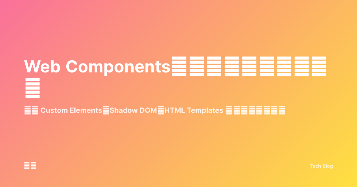
三大核心技术
Web Components 组成:
┌─────────────────────────────────────────────────────┐
│                                                     │
│   Custom Elements                                   │
│   └── 自定义 HTML 标签                              │
│                                                     │
│   Shadow DOM                                        │
│   └── 样式和 DOM 隔离                               │
│                                                     │
│   HTML Templates                                    │
│   └── 可复用的模板片段                              │
│                                                     │
└─────────────────────────────────────────────────────┘| 特性 | 优势 | 应用场景 |
|---|---|---|
| 原生支持 | 无需框架 | 跨项目复用 |
| 样式隔离 | 不污染全局 | 微前端 |
| 框架无关 | 通用性强 | 设计系统 |
Custom Elements
基础组件
// 定义自定义元素
class MyButton extends HTMLElement {
  constructor() {
    super();
    this.attachShadow({ mode: 'open' });
  }

  // 组件挂载时
  connectedCallback() {
    this.render();
    this.setupEventListeners();
  }

  // 组件卸载时
  disconnectedCallback() {
    this.cleanup();
  }

  // 观察的属性
  static get observedAttributes() {
    return ['variant', 'disabled'];
  }

  // 属性变化时
  attributeChangedCallback(name: string, oldValue: string, newValue: string) {
    if (oldValue !== newValue) {
      this.render();
    }
  }

  private render() {
    const variant = this.getAttribute('variant') || 'primary';
    const disabled = this.hasAttribute('disabled');

    this.shadowRoot!.innerHTML = `
      <style>
        :host {
          display: inline-block;
        }
        button {
          padding: 8px 16px;
          border: none;
          border-radius: 4px;
          cursor: pointer;
          font-size: 14px;
          transition: all 0.2s;
        }
        button.primary {
          background: #3b82f6;
          color: white;
        }
        button.primary:hover {
          background: #2563eb;
        }
        button.secondary {
          background: #e5e7eb;
          color: #374151;
        }
        button:disabled {
          opacity: 0.5;
          cursor: not-allowed;
        }
      </style>
      <button class="${variant}" ${disabled ? 'disabled' : ''}>
        <slot></slot>
      </button>
    `;
  }

  private setupEventListeners() {
    const button = this.shadowRoot!.querySelector('button');
    button?.addEventListener('click', (e) => {
      if (!this.hasAttribute('disabled')) {
        this.dispatchEvent(new CustomEvent('my-click', {
          bubbles: true,
          composed: true,
          detail: { timestamp: Date.now() }
        }));
      }
    });
  }

  private cleanup() {
    // 清理事件监听等
  }
}

// 注册组件
customElements.define('my-button', MyButton);
使用组件
<!-- HTML 中使用 -->
<my-button variant="primary">点击我</my-button>
<my-button variant="secondary" disabled>禁用状态</my-button>

<script>
  document.querySelector('my-button').addEventListener('my-click', (e) => {
    console.log('按钮被点击', e.detail);
  });
</script>
Shadow DOM
样式隔离
class StyledCard extends HTMLElement {
  constructor() {
    super();
    // 创建 Shadow DOM
    const shadow = this.attachShadow({ mode: 'open' });

    shadow.innerHTML = `
      <style>
        /* 这些样式只在组件内部生效 */
        :host {
          display: block;
          border: 1px solid #e5e7eb;
          border-radius: 8px;
          overflow: hidden;
        }

        /* 根据属性变化样式 */
        :host([elevated]) {
          box-shadow: 0 4px 6px -1px rgba(0, 0, 0, 0.1);
        }

        /* 上下文样式 */
        :host-context(.dark-theme) {
          border-color: #374151;
          background: #1f2937;
        }

        .header {
          padding: 16px;
          background: #f9fafb;
          border-bottom: 1px solid #e5e7eb;
        }

        .content {
          padding: 16px;
        }

        /* 穿透样式的插槽 */
        ::slotted(h3) {
          margin: 0;
          font-size: 18px;
        }
      </style>

      <div class="header">
        <slot name="header"></slot>
      </div>
      <div class="content">
        <slot></slot>
      </div>
    `;
  }
}

customElements.define('styled-card', StyledCard);
使用插槽
<styled-card elevated>
  <h3 slot="header">卡片标题</h3>
  <p>这是卡片的内容,会显示在默认插槽中。</p>
  <p>可以有多个元素。</p>
</styled-card>
HTML Templates
模板定义
<!-- 在 HTML 中定义模板 -->
<template id="user-card-template">
  <style>
    .user-card {
      display: flex;
      align-items: center;
      padding: 16px;
      border: 1px solid #e5e7eb;
      border-radius: 8px;
    }
    .avatar {
      width: 48px;
      height: 48px;
      border-radius: 50%;
      margin-right: 12px;
    }
    .info h4 {
      margin: 0 0 4px;
    }
    .info p {
      margin: 0;
      color: #6b7280;
      font-size: 14px;
    }
  </style>
  <div class="user-card">
    <img class="avatar" />
    <div class="info">
      <h4></h4>
      <p></p>
    </div>
  </div>
</template>
使用模板
class UserCard extends HTMLElement {
  constructor() {
    super();
    this.attachShadow({ mode: 'open' });

    // 克隆模板内容
    const template = document.getElementById('user-card-template') as HTMLTemplateElement;
    const content = template.content.cloneNode(true);
    this.shadowRoot!.appendChild(content);
  }

  connectedCallback() {
    this.updateCard();
  }

  static get observedAttributes() {
    return ['name', 'email', 'avatar'];
  }

  attributeChangedCallback() {
    this.updateCard();
  }

  private updateCard() {
    const name = this.getAttribute('name') || '';
    const email = this.getAttribute('email') || '';
    const avatar = this.getAttribute('avatar') || '';

    const root = this.shadowRoot!;
    root.querySelector('.avatar')?.setAttribute('src', avatar);
    root.querySelector('h4')!.textContent = name;
    root.querySelector('p')!.textContent = email;
  }
}

customElements.define('user-card', UserCard);
高级模式
响应式属性
class ReactiveComponent extends HTMLElement {
  private _count = 0;

  constructor() {
    super();
    this.attachShadow({ mode: 'open' });
  }

  // Getter/Setter 实现响应式
  get count() {
    return this._count;
  }

  set count(value: number) {
    this._count = value;
    this.render();
    this.dispatchEvent(new CustomEvent('count-changed', {
      detail: { count: value }
    }));
  }

  connectedCallback() {
    this.render();
  }

  private render() {
    this.shadowRoot!.innerHTML = `
      <style>
        :host {
          display: inline-flex;
          align-items: center;
          gap: 8px;
        }
        button {
          width: 32px;
          height: 32px;
          border: none;
          border-radius: 4px;
          background: #3b82f6;
          color: white;
          cursor: pointer;
        }
        span {
          min-width: 40px;
          text-align: center;
          font-size: 18px;
        }
      </style>
      <button id="dec">-</button>
      <span>${this.count}</span>
      <button id="inc">+</button>
    `;

    this.shadowRoot!.getElementById('dec')!.onclick = () => this.count--;
    this.shadowRoot!.getElementById('inc')!.onclick = () => this.count++;
  }
}

customElements.define('reactive-counter', ReactiveComponent);
表单集成
class CustomInput extends HTMLElement {
  static formAssociated = true;
  private internals: ElementInternals;

  constructor() {
    super();
    this.internals = this.attachInternals();
    this.attachShadow({ mode: 'open' });
  }

  connectedCallback() {
    this.render();
  }

  private render() {
    this.shadowRoot!.innerHTML = `
      <style>
        input {
          width: 100%;
          padding: 8px 12px;
          border: 1px solid #d1d5db;
          border-radius: 4px;
          font-size: 14px;
        }
        input:focus {
          outline: none;
          border-color: #3b82f6;
          box-shadow: 0 0 0 3px rgba(59, 130, 246, 0.1);
        }
      </style>
      <input type="text" />
    `;

    const input = this.shadowRoot!.querySelector('input')!;
    input.addEventListener('input', (e) => {
      const value = (e.target as HTMLInputElement).value;
      this.internals.setFormValue(value);
    });
  }

  // 表单重置时
  formResetCallback() {
    this.shadowRoot!.querySelector('input')!.value = '';
    this.internals.setFormValue('');
  }

  // 表单验证
  get validity() {
    return this.internals.validity;
  }

  get validationMessage() {
    return this.internals.validationMessage;
  }
}

customElements.define('custom-input', CustomInput);
与框架集成
React 中使用
// React 包装器
import React, { useRef, useEffect } from 'react';

interface MyButtonProps {
  variant?: 'primary' | 'secondary';
  disabled?: boolean;
  onClick?: (e: CustomEvent) => void;
  children: React.ReactNode;
}

export function MyButtonWrapper({
  variant = 'primary',
  disabled = false,
  onClick,
  children
}: MyButtonProps) {
  const ref = useRef<HTMLElement>(null);

  useEffect(() => {
    const element = ref.current;
    if (element && onClick) {
      element.addEventListener('my-click', onClick as EventListener);
      return () => {
        element.removeEventListener('my-click', onClick as EventListener);
      };
    }
  }, [onClick]);

  return (
    <my-button
      ref={ref}
      variant={variant}
      disabled={disabled || undefined}
    >
      {children}
    </my-button>
  );
}

// 类型声明
declare global {
  namespace JSX {
    interface IntrinsicElements {
      'my-button': React.DetailedHTMLProps<
        React.HTMLAttributes<HTMLElement> & {
          variant?: string;
          disabled?: boolean;
        },
        HTMLElement
      >;
    }
  }
}
Vue 中使用
<template>
  <my-button
    :variant="variant"
    :disabled="disabled"
    @my-click="handleClick"
  >
    <slot></slot>
  </my-button>
</template>

<script setup lang="ts">
defineProps<{
  variant?: 'primary' | 'secondary';
  disabled?: boolean;
}>();

const emit = defineEmits<{
  click: [detail: { timestamp: number }];
}>();

function handleClick(e: CustomEvent) {
  emit('click', e.detail);
}
</script>
Lit 框架
import { LitElement, html, css } from 'lit';
import { customElement, property } from 'lit/decorators.js';

@customElement('lit-button')
export class LitButton extends LitElement {
  static styles = css`
    :host {
      display: inline-block;
    }
    button {
      padding: 8px 16px;
      border: none;
      border-radius: 4px;
      cursor: pointer;
      background: var(--button-bg, #3b82f6);
      color: var(--button-color, white);
    }
    button:hover {
      filter: brightness(0.9);
    }
    :host([disabled]) button {
      opacity: 0.5;
      cursor: not-allowed;
    }
  `;

  @property({ type: String }) variant = 'primary';
  @property({ type: Boolean }) disabled = false;

  render() {
    return html`
      <button
        class=${this.variant}
        ?disabled=${this.disabled}
        @click=${this._handleClick}
      >
        <slot></slot>
      </button>
    `;
  }

  private _handleClick() {
    if (!this.disabled) {
      this.dispatchEvent(new CustomEvent('lit-click', {
        bubbles: true,
        composed: true
      }));
    }
  }
}
最佳实践总结
Web Components 最佳实践:
┌─────────────────────────────────────────────────────┐
│   组件设计                                          │
│   ├── 单一职责原则                                  │
│   ├── 使用有意义的标签名                            │
│   ├── 提供合理的默认值                              │
│   └── 支持属性和特性同步                            │
│                                                     │
│   样式处理                                          │
│   ├── 使用 CSS 变量支持定制                         │
│   ├── 合理使用 :host 和 ::slotted                   │
│   ├── 考虑外部样式穿透需求                          │
│   └── 提供主题支持                                  │
│                                                     │
│   性能优化                                          │
│   ├── 延迟加载非关键组件                            │
│   ├── 复用模板实例                                  │
│   ├── 批量更新 DOM                                  │
│   └── 清理事件监听器                                │
│                                                     │
│   可访问性                                          │
│   ├── 使用语义化标签                                │
│   ├── 添加 ARIA 属性                                │
│   ├── 支持键盘导航                                  │
│   └── 管理焦点                                      │
└─────────────────────────────────────────────────────┘| 场景 | 推荐方案 |
|---|---|
| 简单组件 | 原生 API |
| 复杂组件 | Lit 框架 |
| 设计系统 | Stencil |
| 跨框架复用 | Web Components |
Web Components 是构建可复用 UI 的原生标准。框架来来去去,Web 标准永存。